

That wasn’t Jesus in the parking lot, man.
Sure it was. But it’s spelled Jesús, and he was just an immigrant trying to make a better life for him and his family back home in Mexico.
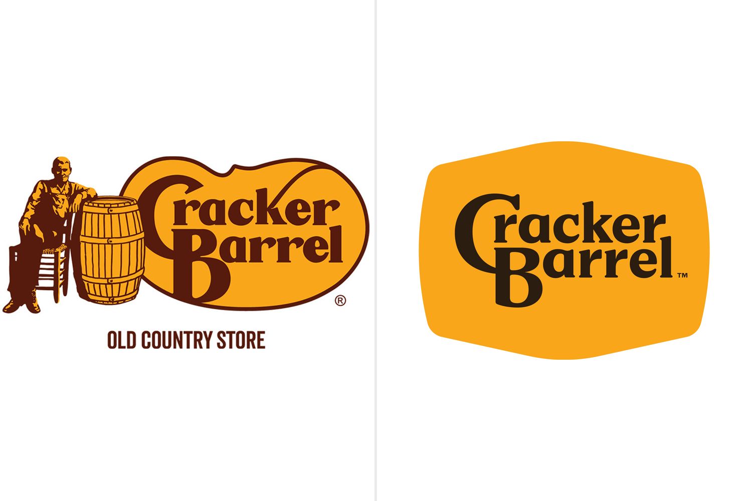
I’m not an American and I’ve only seen this logo a couple of time but I’ll be completely honest - this remodel fucking sucks.
I despise minimalism and these transitions from oldschool cool to these post-modernist corporate garbage. And that’s definitely one.
what that’s why everyone is bitching about it? like THAT?? how is that “going woke”? i guess woke is when you sans-serif.
Its woke because they took the cracker off. They are erasing crackers
I never said it’s going woke, don’t throw me into that box.
i didn’t say you were; i was referring to everyone on twitter claiming it was
I mean it still has serifs its just losing the old guy, the barrel, the outline and the flourish on the K
Honestly, I can see why an old guy with his hand in a barrel might be off putting for a restaurant theme
I agree with that last part. The serifs did shrink quite a bit though and Rs are completely lost them.
I hate it as well, my theory is that it’s done for better readability on small screens such as phones.
If they had removed the old timer and the barrel but left the asymmetrical shape behind the text just as it was, then they might have been on to something.
I really like the geezer with his drum to be frank!
Logo matches the food now, it’s perfect.
The new one
He was right. Jesus would never tolerate this. Time to flip some barrels.
It’s on like Donkey Kong!
Tbf the old logo is much better
It’s following the modern trend of flat clean lines. I’m getting rather sick of it TBH
I absolutely hate basically everything about modern logos and UI design. It looks like shit, and for UIs it’s not even efficient usually.
soulless minimalism
It’s better in some ways, worse in others. It’s shit for a thumbnail, for example. The old one stand out more, but the new one is more readable and fits into any format.
Yeah, I think so too. I don’t see why they had to change the font, at least the C had character. Now it’s the most boring plain forgettable font imaginable and black at that. It’s like they didn’t even try.
Lmao they got rid of the cracker and the barrel
The barrel is still there. The background is a barrel.
I thought it was a cracker.
I’m pretty confident it’s supposed to be a barrel, but it might also be a cracker. I can see that too.
What? How is this any « woke » even for the MAGA lunatics ??
[edit]: Apparently the company had a diversity / non-discrimination campaign in recent years. It explains.

Anything they dont like is “woke”
They had a DEI/nondiscrimination campaign because of several high profile stories where restaurants were accused of racism (black diners being asked to move away from seats visible from the entrance, at least one black person being told “we don’t serve your kind” or words to that effect.)
Ugh I can just SMELL the WOKENESS. If I look at this ANY LONGER I might be AWOKENED
I mean, it’s less visually noisy, but that’s it?
This dude’s willing to go to arms over this?
It makes the size of the logo versus the text look like nothing but wasted space. Hell, versus the text portion, it looks like MORE extra space is used than the old logo, ony with zero charm or familiarity to show for it.
If they wanted to re-brand as a truck-stop, merge with Love’s, don’t just rip-off their color-scheme minus the Heart.
Wtf does « gave my life to Christ » means in that situation? Did mf get baptized in the parking lot??
i think he gave a life altering blowjob in that parking lot
To Jesus?
i don’t expect cracker barrel parking lot sex partners to give real names
Dedicated it to Jesus
Bro put it ong fr fr no cap
Swallowed for the lord.
Got engaged to a guy in the parking lot. That’s my made up story and I’m sticking to it.
Can someone seriously answer this question. I’m losing my mind over here. WTF does it mean?
Got shot by someone named Josh
Maybe it rained a lot and dumpsters were water tight back in his day.
Only Baptists baptize, and it’s literally dunking your whole body into water. We had a huge tub behind the pulpit, it was about three feet deep and 12’x8’. I can’t imagine that happening in a Cracker Barrel parking lot, unless it’s one of those pool-in-a-pickup-truck-bed situations.“Giving your life to Christ” is basically what it sounds like. An often emotional moment in which you make a personal commitment to the Biblical idea of Christ and his teachings. Think of it like an epiphany.
Edit: my bad guys, I got the terminology wrong about which sect of bigots have wet tshirt contests.
Only Baptists baptize
No, absolutely not. Baptism is arguably the most important sacrament for all christian churches! Where I’m from, the catholique baptism is typically done for babies by gently pouring water on their forehead. Ofc it’s less spectacular than the “full immersion” baptism by the Baptists (also used by the pentcotalists as well btw).
But anyway, none of that make sense to be done in a parking lot. Reading the other comments, I like the idea that the dude got suddenly touched by grace after eating a gross fish meal at Cracker Barrel!
Mormons do the full dunk, too. Just sayin.
Only Baptists baptize
Uh, can you clarify what you mean by this?
No, my bad. Of course other Christian sects baptize, though not all of them practice full immersion.
Denominations is the word you may want to use in case you’re around Christians btw 😉
Baptisms aren’t just a Baptist thing, though they generally put more weight behind it than most other denominations that do it. At least from what I’ve seen.
I was Pentecostal growing up, and a few times a year- generally around Christmas and Easter- they’d do an open baptism and anyone who wanted could get dunked. I went to one church without that big tub behind the pulpit you’re talking about- they’d do it in the river nearby. Cold as hell in the winter.
Basically every brand of Christianity that I’m aware of has some form of baptism, though the exact way it’s done varies a lot.
Matthew 28:19 is, “Therefore go and make disciples of all nations, baptizing them in the name of the Father and of the Son and of the Holy Spirit”
I was baptised in the Church of England.
I remember getting on my knees for Jesus in the cracker barrel parking lot.
Life made so much more sense once his warm love filled me.

~To each their own.~
Another chapter in “Everything i do not like is woke”
The new design is minimalistic slop, for sure. But why would i give a fuck about a companies logo. Honestly we should not even be reacting to this bait.
I’m confused. The new logo is great, or it’s shit, I don’t care. But what does it have to do with wokeness? Did the old man sitting by the barrel start sucking dick on the billboard? Has he transitioned? Does the new logo secretly spell out black lives matter in invisible ink? It’s just the name in a sort of blob? How is this political? What am I missing here?
But what does it have to do with wokeness?
See this handy guide for the way these dipshits think.
Austin A-series - small foreign engine. Definitely woke.
At this point it’s just that a thing changed from “back in my day.”
Woke doesn’t mean anything specific more, it just means “thing I don’t like.” So when somebody says they want to end wokeness, they mean they want to remove everything they don’t personally approve of.
I’ve been messing with the idea of stealing this from them. Just call everything I don’t like woke 🤷🏾♂️
Racism is woke now. Misogyny is woke. Conservative Christianity is woke. Trump is woke. Just give them the whole word and confuse the hell out of everyone.
Perhaps he feels the original logo depicted a white cishet male, and thus the new one is erasure.
Come-on everybody knows that barrel is full of dildos pickled in anal lube.
No, that would be my nightstand drawer
and where might i find a cracker barrel so i can know to, uh, avoid it and get directions away from there.
They chain the barrel like they chain the rocking chairs, dudes freaky af for sure.
Snowflakes getting their feelings hurt because pictures change
They took the orange man off their logo. This is obviously a statement against Trump and therefore woke.
The new logo is definitely worse, I’ll give them that.
Just typical corporate mediocrity.
And someone probably got paid thousands for that new logo.
Probably more than thousands. I bet there were focus groups involved too.
All these black people thinking Trump will help their careers 😂
Do we know if this is a real person or an AI “black person”?
Neither. It’s a white conservative piece of shit pretending to be a minority. It’s been around far longer than “AI”.
This guy is a republican congressman. Definitely a real black guy.
His twitter handle is different.
Either way, there is a well estbalished history of conservative dipshits pretending to be minorities on social media that support conservative ideals.
Did you go to his twitter? It’s a different handle.
This isn’t “woke”, this is the corporate trend of oversimplifing logos no matter how much people liked the old ones.
Cool story, bro. Where are the Epstein files?
It’s not just the logo, they’re remodeling the inside to be more “modern”. The kitschy americana vibe was the only reason people go there.
According to people I know who worked in the kitchen there, the correct reason to go to cracker barrel is actually their biscuits and gravy.
The cheapest way for them to make 'em is from scratch. Everything else is premade bags and mixes, but the biscuits and gravy are made fresh a few times a day.It sure as fuck it wasn’t the food!
Conservatives crying buckets of tears over a corporation’s new logo is my kink.
The heraldry of corporate feudalism is no laughing matter for capitalist serfs.
I have no idea if this actually matters but, as a former printer, the new logo is easier and cheaper to produce. The print plates will be cheaper and the lack of thin lines mean it will be more durable too. The wide open spaces mean that the alignment between the brown and orange doesn’t need to be perfect anynore (less waste).
It might be a terrible design for a logo (I don’t know, not my area) but it’s a good design for printing.
I mean yeah, but as a consumer I don’t want to look at a bunch of bland logos with no detail everywhere I go. It’s boring. I don’t care how hard they are to print. People have been printing complicated shit for decades. Figure it out. (Not you figure it out, them figure it out).
Southerner here:
Cracker Barrel is literally the worst restaurant I have ever been to. By far.
It was years ago, and I got fried fish and mashed potatoes, and it was so bad I couldn’t eat it. I am not picky: I have never skipped a plated meal at a restaurant, or even at home unless I’m deathly ill. But it was like a tv freezer dinner someone had dipped in water.
…And this is bizarre, as you have no idea how much food is part of the culture down here. Maybe it’s because my family in the south is suburban, not rural, but I have no earthly idea how that chain would get idolized.
I went to cracker barrel semi-regularly growing up. Imo, it is pretty good. Certainly better than fast food or, like, a Chili’s. Maybe their food quality has diminished in the decade since I last ate at one. But iirc, they had good pancakes, mashed potatoes, and mac and cheese. The hash brown casserole and country fried steak were the reasons to enter the building, plus the gravy. Plus you could play checkers while you waited for your table.
I had the fish one time and also found it to be not great. I assume they just have it on the menu to have it.
Maybe fish wasn’t their strong suit? Hmmm.
And man, Steak and Shake or Raising Canes or Rosas are great. Way better than the biggest chain restaurants TBH.
Never been to Rosas.
Steak and Shake was always a little off putting to me because it alwasys smelled like bleach when I walked in thr door. Imo, decent burgers (def better than fast food) and good milk shakes.
I have extremely mixed feelings about Canes. On one hand, I think their food tastes good. On the other hand, I feel like that restaurant is the result of some kind of sinister corporate science experiments in an underground bunker to create feel-goodery. Every peice of chicken is perfect. The sweet tea is too sweet, just like it should be. The canes sauce is distinct enough to be memorable, but not so different as to feel unfamiliar. Their logo is a golden retriever in a bandana. The name of the restaruant rolls off the tongue, but makes literally no sense when you think about it. It’s kind of unsettling on an existential level to me.
Raising Cane’s is as bland as Chick-fil-A, it tastes like nothing. Somehow they made it as bland as unbreaded, unseasoned chicken. And their special sauce is just mayo ketchup and mustard mixed together. Whoopee. IHOP has a better chicken sandwich.
Their pancakes and hashbrowns slapped when I was a kid. Has it just gotten worse or do I have rose tented glasses because of how old I was at the time?
I went to one couple of years ago. Order a chicken fried steak dinner. Fucking thing was tiny, and only got one scoop mash potatoes. It was shit to. Glad I wasn’t paying, and have no plans on returning.


