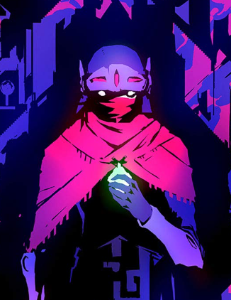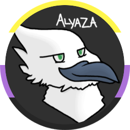

hey folks, quick update to say you’ve probably noticed our new community icons.
these icons were lovingly crafted by @UrLogicFails@beehaw.org, who posted them a couple of days ago over in Creative. we took notice of them and obviously–because they’re our community icons now–really, really liked them.
thanks to his generosity in working things out with us, we’re pleased to announce we can use his icons under a Creative Commons license for the site! until further notice they’ll be our site icons, with credit to him on our sidebars. we’ll also be adding attribution to the community sidebars over the rest of day as time permits.
we’re also pleased to report that, thanks to your generosity, we’ve been able to reasonably compensate him for all 33 of the icons he’s made for the community! the agreed to rate is $5 per icon, for a total of $165 that’s been paid out to him as of today. this expense has been reflected on our Open Collective. (we’ve also agreed to, as possible, commission him for any future community icons until further notice, which will be subject to that same rate.)
hopefully you enjoy the new icons, and please thank UrLogicFails for the work here! thanks for using the site again folks!
You must log in or register to comment.
They look fabulous! <3
deleted by creator
we should be doing this tomorrow around 7 or 7:30 am ET, with up to 30 minutes of downtime.
deleted by creator
deleted by creator
Thanks so much for being here and taking reddit refugees in. Already feels like a warm place. :)
QUESTIONS:
-
Is there a way to filter out content I don’t want to see on the front page? I’m already seeing Trump news, for example.
-
I have subscribed to some cool communities. It would be great to have posts from those communities served up as my main view. I can’t figure out how to get those to be what I’m seeing by default. Any tips on customizing my experience?
Thanks again!!
Testing memmy
You can filter out communities and users via your profile settings, but I don’t know of a way to filter on specific words/terms/regex.
Okay, thank you. Yeah - looks like that’s the case. Thanks!
For question 1: I don’t think that’s a feature unfortunately.
For question 2: The main screen has three views : Subscribed (All your subscriptions) / Local (All Beehaw communities) / All (All of the stuff on Lemmy)
I think it might be a bug, cause i cant figure ou another explanation for it, but sometimes my local shows lemmy.world mixed in with beehaw (I do subscribe to them and a bunch of others but thats the only one that does that) and all does nothing at all, it just remixes local.
I have to insist a bit for the page to actually show me the all page. It’s completely understandable considering everything right now, so I’m not really annoyed at it.
I think you have the “Randomly appear posts at the top” bug that is unfortunately fairly common. I would hope it’s fixed in the next update to Lemmy we’re doing tomorrow morning.
Okay, thank you. I just saw the Subscribed option. The UX could be a bit clearer, overall… but so far, this is great. I’m bummed about the inability to filter out content I don’t want to see, though.
Thanks for the quick answers! :)
The UX could be a bit clearer, overall
Feel free to add suggestions to the devs’ Issue tracker on Github (after searching for duplicates). Could take them a while to respond since they’re very busy bees preparing the next big Lemmy release right now.
-
They look great!
I’m diggin’ it.
Cool! They’re very neat!
Love them! And yes for consistency. Great work.
Excellent!
I think this is the first time that I saw someone’s voluntary art work compensated after being implemented in a community. The transparency is surreal and very admirable. Thank you for compensating artists and valuing the art that @UrLogicFails@beehaw.org made c:
Said this in a private chat, but I’ll repeat it here for transparency
While we can’t guarantee anything with regards to donations, I will always vote to pay artists even if it meant we had to go begging for donos to help run the site later
Agreed! The icons are great, and the open compensation and transparency is lovely as well.
Love the icon set, really love that @UrLogicFails@beehaw.org gets more than just credit.
I love the honeycomb shape and the designs are super clean. Thanks again @UrLogicFails@beehaw.org
I love the new icons, now they fit perfectly with the instance. I think that we also need a new logo, maybe a more minimalistic one (while still having the cowboy bee).
I think it would be super cool to regularly rotate the logo with user submitted and/or funded art, but I might be a little eclectic 😅
That’s a good idea, but I think having a single great logo is better for our identity
Yeah I’m not pushing for it, I understand why a cohesive brand is desirable, perhaps even more so in a confusing landscape (especially for those new to the fediverse).
I would love a rotating logo like this. It would be awesome, and tbh why should we be concerned with branding? Why can’t our brand be “kickass cowboy bee art”?
Hell yeah I got one vote 😤
Fit perfectly is right. I refreshed and my eyes instantly detected a change but it took a minute to hone in on what it was. They just fit in like they’ve always been there. Fantastic execution.
This post right here has convinced me that Beehaw is something special. It makes me so happy to see the community respected in this way
Pretty phenomenal. Love you uniformity it gives the Beewas SubLems.
Oh man you guys are the best