

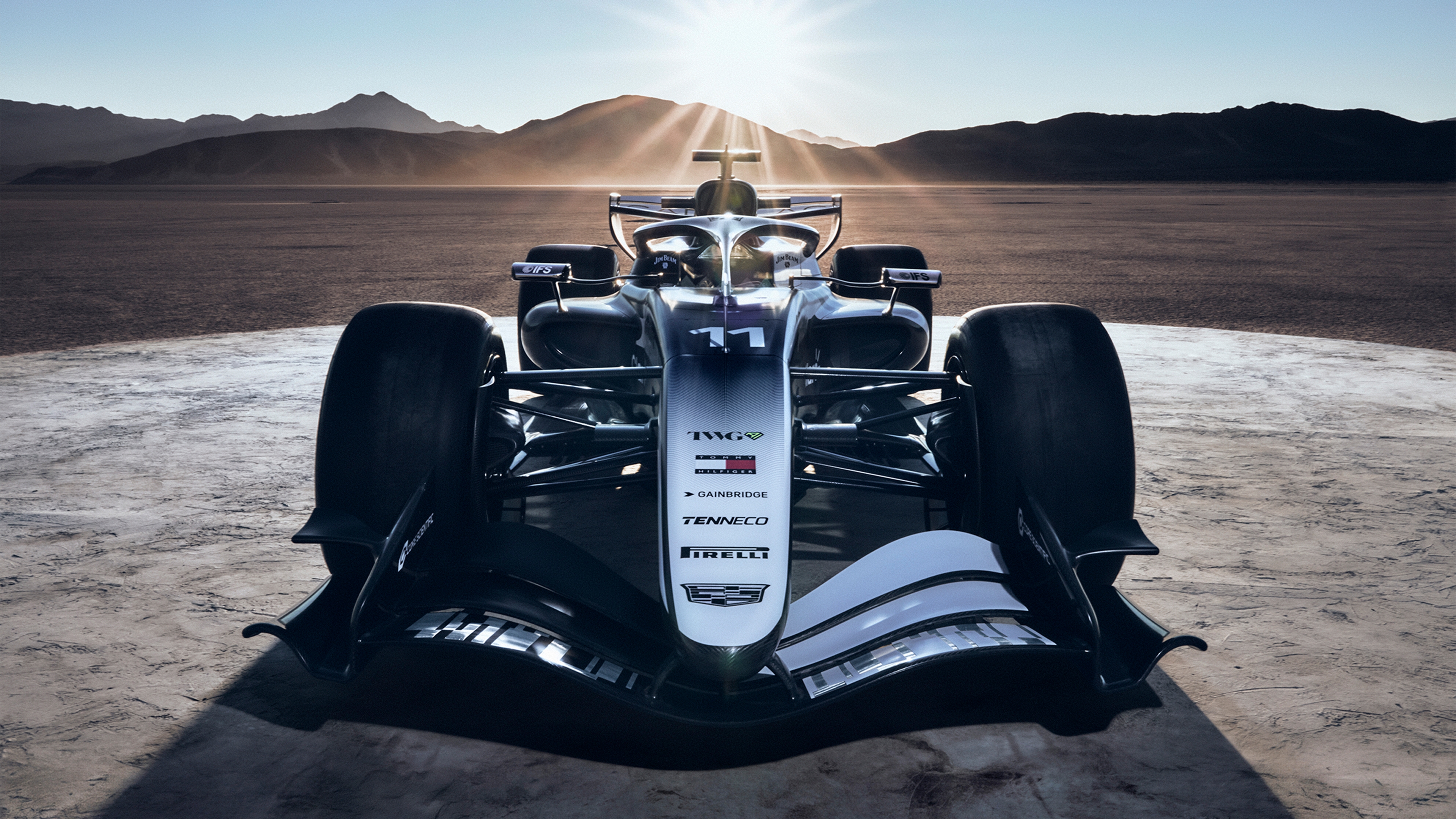
It’s weird, to me it has too much and too little going on at the same time: I love the italic Cadillac merging and splitting B/W, but then they mush everything with the gradient and the strange faded logo pattern at the back. I didn’t yet see a top view, though, where the design should give its best. The white wheels are awesome!
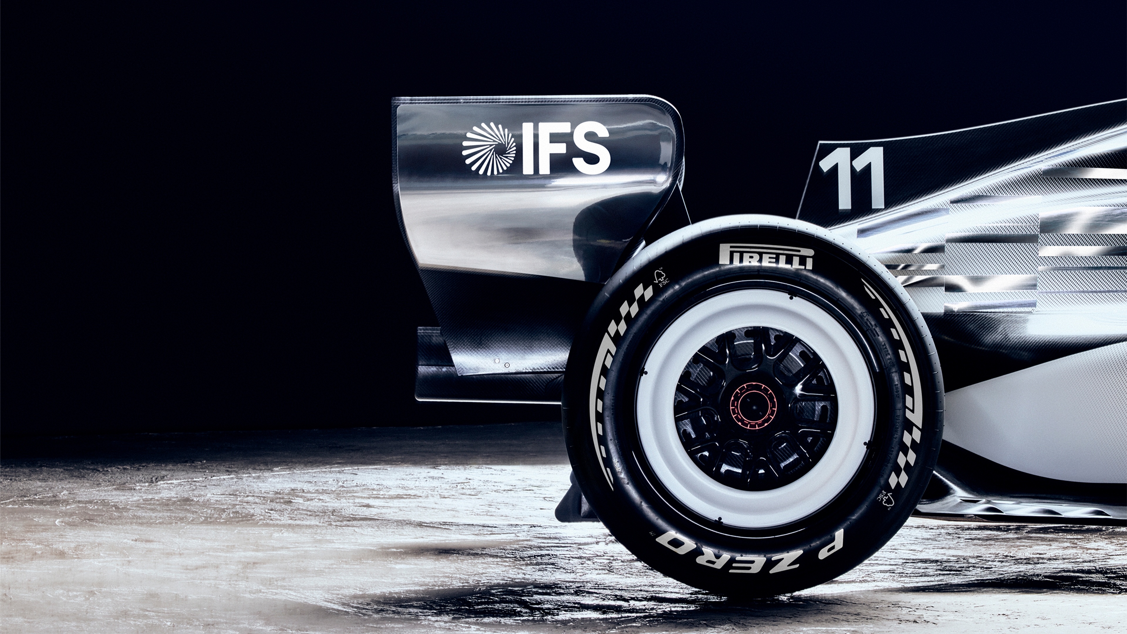
White wheel walls are awesome and I think it looks okay from the white side, if a little boring. I don’t like it at all from the black side and it doesn’t really feel like the asymmetry adds anything other than a talking point. I wonder what a mockup of just the white side duplicated would look like.
The chrome bits on the logo towards the rear look great though, if they keep that in it’ll look awesome in direct sunlight.
Cool that it’s a split livery, but it really could use some color. The liveries on their wec cars are pretty cool, would’ve loved to see something more similar to those.
Front:
White wheel rims:
West-McLaren-Mercedes vibes.
Pretty sure Michael Bay did black and white first.
That car is going to look dirty at the end of races.
I like it. It’s like seeing a domino race down the track.
I didn’t expect them to feature the team owner (TWG) so big, has a bit of a Haas feel that way. Looks quite nice though! I hope in the actual races we can differentiate it enough from the Audi and Mercedes cars.


