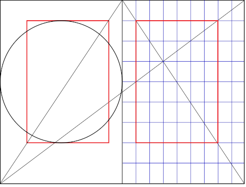
Jan Tschichold and Raul Rosariva independently researched the layout of medieval books, and each came up with a method of construction. Rosarivas version (to the right) lends itself very well to a programmatic approach. We could implement it (in luaTeX) in a few lines like this:
% Page size (proportions 2:3)
\pagewidth=150mm
\pageheight=225mm

% Undo 1 inch origin (personal preference)
\pdfvariable horigin 0pt
\pdfvariable vorigin 0pt

% Inner margin
\hoffset=\pagewidth
\divide\hoffset by9

% Top margin
\voffset=\pageheight
\divide\voffset by9

% Type area width
\hsize=\pagewidth
\divide\hsize by9
\multiply\hsize by6

% Type area height
\vsize=\pageheight
\divide\vsize by9
\multiply\vsize by6
This is all well and good if we have vertically stretchable material on every page. But… if we want to do grid typesetting, we will quickly run into “Underfull \vbox (badness 10000)”.
Let’s say we’ve set \parskip=0pt.
\topskip=10pt and \baselineskip=12pt
\showthe\vsize produced “426.79129pt” in the log.
Right now we have 35 lines: \topskip + 34 \baselineskips, which is 10pt+(34*12pt) = 418pt, i.e. less than \vsize, but there’s no room for adding another line.
Something has got to give.
One way is to define \vsize as a set number of lines, and then adjust \baselineskip to be slightly bigger to make \vsize be in accordance with the golden canon.
Either we stay with 35 lines and increase \baselineskip slightly, or we decrease \baselineskip to fit one more line. This is where you have to make a call based on what would make it better as a whole. In this case, I think it wouldn’t hurt with a little extra leading, so I’ll stick with 1+34 lines and go back and change \vsize:
\vsize=\topskip
\advance\vsize by 34\baselineskip
Now all that is left is to figure out how much to increase \baselineskip. We can leave \topskip as it is, at 10pt, so we’re left with 426.79129pt - 10pt = 416.79129pt.
Divide that with 34 lines:
416.79129pt / 34 is approximately 12.2586pt, so we go back and set \baselineskip to that.
\baselineskip=12.2586pt
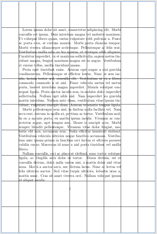
Now we have something like this (with added guidelines):

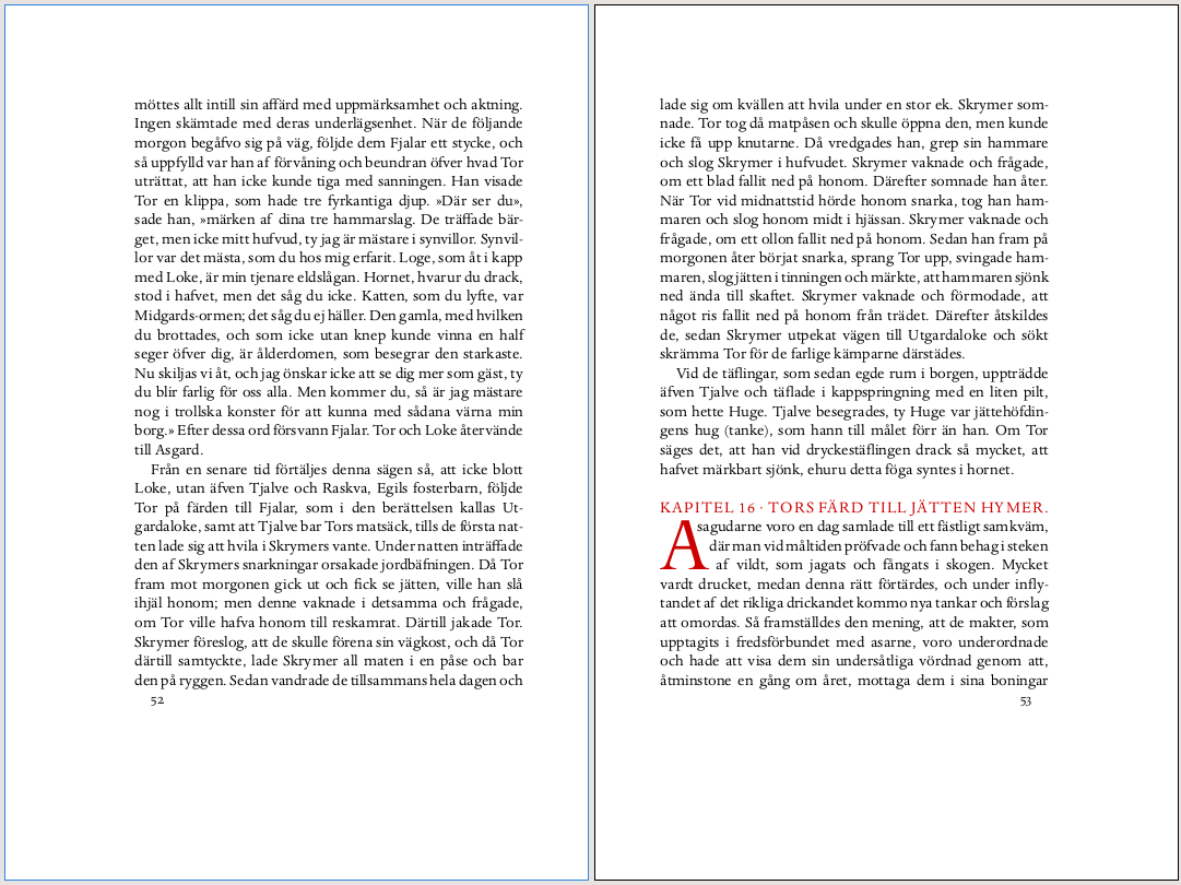
Finally, if our goal here is to make a type area rectangle of a certain proportion, it could be argued that the first line should have its x-height touch the upper border of the rectangle. The bulk of a line contributing to color is made up of the lower case letters. In that case we could adjust \voffset:
\advance\voffset by-\topskip
\advance\voffset by 1ex
but then we would also have to compensate the total \vsize and figure out a new \baselineskip.
Disclaimer: I haven’t tested the above code, so there could be spelling errors etc, but it’s more about the reasoning.


