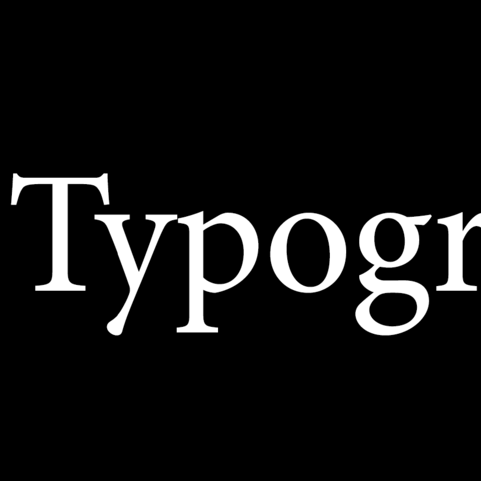
I’ve built a new font! Thoughts and feedback on my approach very welcome.
Very cool!!
So cool! I was wondering where the fonts were, but now I’ve found them on your GitHub repo.
One question/curiosity: is the goal to have a font that looks “consumed by time”? or a font that should look as much as possible as in its original time? I ask this because I notice some final letters have small “ink holes”, they aren’t fully filled.
The answer is… I don’t know :-) Maybe both? What do you think would be best?
Ah, difficult, they are two different and incomparable concepts :) As they are now, I think the fonts reach the first goal: give the appearance of an old and used book. Which is cool.
For the second goal maybe there’s no need to go to such lengths as you did, I imagine pictures of how those fonts looked in their time maybe exist(?).


