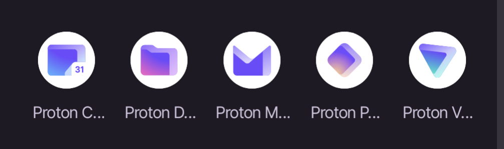
That the labels for the apps get truncated so you can only read “Proton” plus the first letter of the app. I’m only able to distinguish based on the icons which isn’t great because Pass and Drive are similar colors, and Pass and VPN, and Drive and Calendar are similar shapes.
Yeah I noticed this as well, they are too similar and sometimes I open the wrong one by accident
I am always doing this with Proton Mail and Calendar.
I do it more with calendar and drive, both squares of similar sizes